ICR Designer: Build Automated Conversational Flows
Welcome to the ICR Designer (Interactive Chat Response Designer)! This intuitive visual builder allows you to create powerful, automated chat journeys using a drag-and-drop interface. Whether you're setting up support workflows or transactional flows, ICR Designer gives you full flexibility to configure every step, without any coding.
This guide introduces you to the ICR Designer environment, explains how to use various node types, and provides real-world examples for each.
Getting Started with ICR Designer
To begin designing a flow in the ICR Designer:
- Log in to your Ozonetel account and navigate to IVR/ICR Designer under the Admin -> Configuration -> IVR Flows section.
- Click on New IVR Flow and choose the flow type as ICR to start from scratch, or choose can choose an existing template.
- You’ll see a blank Canvas where you can drag nodes from the left panel.
- Connect the nodes to define how your bot interacts with users.
Node and Their Functions
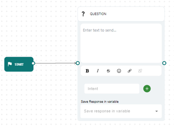
Question
- Description: Captures customer intent through keyword matching or intent-based NLP. You can define expected responses and map them to specific outcomes.
- Use Case: Starting the conversation or gathering intent before branching logic.
- Example: Asking "How can I assist you today?" and routing based on responses like "pricing" or "agent".
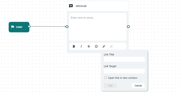
Message
- Description: Sends static or dynamic text messages, including formatting and personalization using variables.
- Use Case: Confirming user actions or providing important info.
- Example: "Thanks [name], your appointment for [slot] is confirmed."
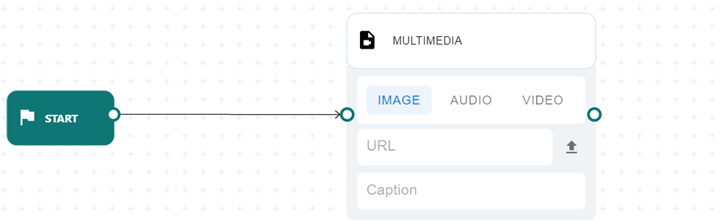
Multimedia
- Description: Sends rich media content such as images, videos, or audio clips.
- Use Case: Enhancing bot experience with tutorials, product visuals, or greetings.
- Example: Sending a video demo after a product inquiry.
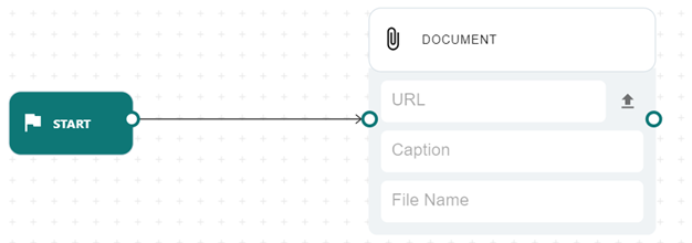
Document
- Description: Lets you share downloadable files like PDFs, Word docs, or images.
- Use Case: Sharing brochures, invoices, or contracts.
- Example: Sending a downloadable PDF after a service selection.
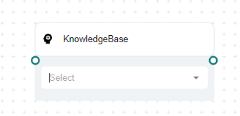
Knowledgebase
The Knowledge base allows you to provide information in a URL or Document, and then train an AI model based on the provided information. This can then be used in the flow using the knowledgebase node. Here is how it works:
-
Create a custom knowledge base repository, utilizing the toolbar option at the top. For more details, refer to the Knowledge Base section.
-
After creating the knowledge base repository, the knowledge base node will present a drop-down list of options for selecting the desired one.
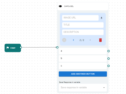
Carousels
- Description: Displays horizontal cards with titles, images, descriptions, and buttons.
- Use Case: Letting users browse multiple items or services visually.
- Example: Displaying three credit card options with “Apply Now” buttons.
Available Operations:
- Carousel Items: The node showcases a series of items, each with an image, title, and description. Customers can navigate through these items using arrow buttons.
- Adding Carousel Items: To add an item, input the image URL, title, and description, then click "Add another Item."
- Image: Upload or enter the URL of an image.
- Title: Title for the card.
- Description: Description of the card.
- Removing Carousel Items: To remove an item, navigate to it and click "Remove Item."
- Button Options: You can add up to four button options by clicking "Create new Button" or "Add another."
- Removing Button Options: Hover over a button option and click the "delete" icon to remove it.
- No Match Option: Use the "No Match" option when none of the button options match the user's selection.
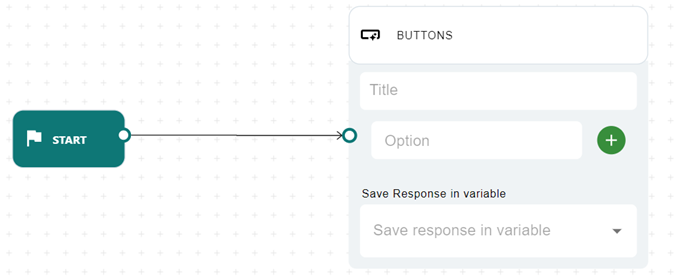
Buttons
Description: Presents predefined buttons for easy user selection and routing.
Use Case: Prompting quick decisions.
Example: Presenting "[Check Balance] and [Transfer Funds]" after login.
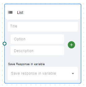
List
- Description: Provides a vertically scrollable list of options, each with a title and optional description.
- Use Case: Presenting categorized menus.
- Example: Selecting a support topic from a dropdown list.
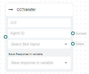
CCTransfer
- Description: Transfers the session from the bot to a live call center agent.
- Use Case: Escalation to human agents when requested or when AI confidence is low.
- Example: User says "Talk to agent" → CCTransfer to support queue.
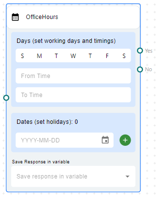
Office hours
- Description: Evaluates date/time rules to determine if the conversation is within business hours.
- Use Case: Directing users to a queue or fallback when support is offline.
- Example: Between 9 AM – 6 PM, forward to agent; otherwise, show an offline message.
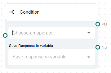
Condition
- Description: Allows branching logic based on user input, API response, or variable value using conditions.
- Use Case: Validating inputs and directing flows accordingly.
- Example: If city = "Bangalore", proceed to location-specific handler.
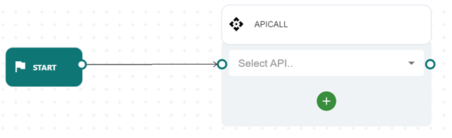
API call
- Description: Sends real-time requests to external systems and consumes the result.
- Use Case: Fetching order status, KYC status, or validating phone numbers.
- Example: Check customer eligibility via a GET request and show the relevant outcome.
If the API list is empty, you can create one by accessing the "Rest API" option in the top right toolbar. For instructions on creating a Rest API, refer to the Rest API section.
Fields & Operation:
- API: The API Call Node provides a dropdown list of APIs that you can select from. Once you select an API, the node will be configured to make a request to that API when it is executed.
- Select Api: After selecting the API from the list, click on the “Add” Response button. This will display two additional dropdown fields to save response information in variables.
- Editing a Response Variable: After clicking the add button two fields are displayed: 'API response variables' and 'Variable'. The 'API response variables' field is a dropdown list that allows you to select the part of the response that you want to save. The 'Variable' field allows you to select the variable that you want to save the response part to. You can save multiple parts of response in different variables.
Builtin Functions
The 'Builtin Function' node offers a range of operations to manipulate variable data, including functions like trim, append, to Lower, etc.
Fields & Operations:
- Adding an operation: Choose an operation from the dropdown list provided. Once selected, the node will execute the chosen operation.
- Configuring Parameters: After adding an operation, you will see a list of parameters for that operation. These parameters are the inputs to the operation. You can enter values for these parameters in the text fields provided.
- Deleting an operation: To remove an operation, click the delete icon next to it.
- Understanding Operations: Each operation serves a specific purpose. For instance, 'trim' removes whitespace from the start and end of a string, 'append' joins two strings, and 'toLower' converts a string to lowercase. The 'params' field indicates the type and number of parameters required for each operation.
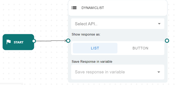
Dynamic List
- Description: Generates options like buttons or lists based on external API responses.
- Use Case: Displaying real-time data such as available appointment slots.
- Example: Show time slots fetched from a booking engine.
Fields & Operations:
-
Select API: Choose an API from the dropdown list of APIs created using the Rest API option. You can type in this field to filter the list of APIs and select the one you want to use.
-
Show Response As: This is a toggle button that allows you to choose how you want to display the response from the selected API. Toggle between 'List' and 'Button' to determine the format of the API response display.
-
API Response format required for the Dynamic list:
{

"DATA": [

{

"DESCRIPTION": "TELUGU",

"TITLE": "TELUGU"

},

{

"DESCRIPTION": "HINDI",

"TITLE": "HINDI"

},

{

"DESCRIPTION": "ENGLISH",

"TITLE": "ENGLISH"

}

],

"TITLE": "CHOOSE YOUR LANGUAGE."

}
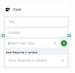
Forms
- Description: Presents users with input fields such as name, email, or dropdowns to collect structured information.
- Use Case: Capturing lead data, booking appointments, or registering feedback.
- Example: A form with fields like Name, Email, and Preferred Call Time, storing each input in a variable.
WA Template
- Description: The WA Template node allows you to use pre-approved WhatsApp message templates directly within the ICR flow. These templates are configured in Meta Business Manager and can be selected here for quick deployment.
- Use Case: Sending notifications, OTPs, or transactional alerts.
- Example: "Your booking for [date] at [time] is confirmed."
Here is how you can do:
- Template Type: Choose the type of template you want to use, such as Form or Carousel.
- Template Selection: You can either select a template from the available list or manually enter the template name.
- Template Content: Define or edit the content placeholders based on the selected template structure.
- Response Handling: Optionally, save user responses to a variable for further actions or conditions within the flow.
NoteEnsure that the template you want to use is already approved and available in your Meta Business Account.
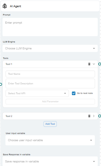
AI Agent
- Description: The AI Agent node uses Large Language Models (LLMs) to autonomously interact with users, execute tasks, and deliver intelligent, context-aware responses. It enables your ICR (Interactive Chat Response) flows to become smarter by dynamically handling conversations based on the configured instructions.
- Use Case: Handling open-ended questions before escalation.
- Example: User asks about refund rules → AI Agent replies from loaded knowledge base.
When setting up the AI Agent node:
-
Prompt: Clearly define the task or conversation context. A well-crafted prompt ensures the AI understands the user's intent and delivers accurate and relevant responses.
-
LLM Engine: Select the appropriate LLM model based on your business needs from the available list.
-
Tools Integration: Optionally, the AI Agent can call APIs (tools) during the conversation to fetch dynamic data or perform actions before responding.
-
User Input Variables: Map previous user inputs to feed into the AI agent if needed.
-
Response Variables: Store the AI's output for use in subsequent steps of your ICR flow.
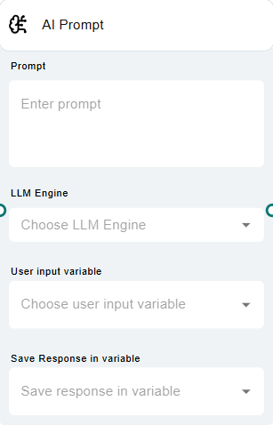
AI Prompt
The AI Prompt node allows you to send dynamic, context-aware prompts to a selected Large Language Model (LLM) and capture its response within your ICR flow.
It acts as a flexible interaction point where you can create AI-driven responses or data processing without setting up a full AI agent conversation.
When setting up the AI Prompt node:
-
Prompt: Define the specific instruction or query you want to send to the LLM. You can include static text or dynamically insert user inputs collected from earlier nodes.
-
LLM Engine: Choose the appropriate LLM model from the available options. Select based on desired response quality, latency, or business needs.
-
User Input Variable (Optional): Map any previously collected user inputs that should be referenced or embedded into the AI prompt dynamically.
-
Save Response in Variable: Capture the LLM’s output into a variable. This response can be used in later parts of the ICR flow for decisions, displays, or further processing.
Rest API
Rest Api provides the flexibility to integrate data from any rest Api into the designer, which then can be saved in a variable which allows us to use these variables in many nodes.
APIs created using this option can be later used in the "API CALL" node. From there you can save the API response to a variable in the APICALL node which allows us to use the saved variable in the flow.
These APIs can also be used in "Dynamic List" to generate list and button nodes using the API response data.
Fields and Operations:
-
Select API: With in the 'REST APIS" tab, at the top of the drawer, there is a dropdown menu labeled "Select API". This is where you can select an existing API request to edit. If the API you want is not listed, you can add a new one by clicking the "Add New API" button.
-
Add New API: Clicking this button opens a form where you can enter details for a new API request.
-
API Form: In this form, you can specify the following fields:
- Name: The name of the API request. This is a required field.
- Type: The type of the HTTP request. This can be either GET, POST, or JSON-POST.
- URL: The URL where the request will be sent. This is a required field.
- Timeout: The maximum time to wait for a response before the request times out.
- Params: You can add parameters to your request by clicking the "Add Params" button. This opens a new section where you can add, edit, or remove parameters.
- Headers: You can add headers to your request in the "Headers" section.
- API Response: This section allows you to specify how the response from the API should be handled. For example, from the response, if you want to save a particular key then add the name of the keys in this list.
- The "Name" and "URL" fields are required. You will not be able to save your API request unless these fields are filled out.
-
Save/Update/Delete: Once you have filled out the form, you can click "Save" to save a new API request, "Update" to save changes to an existing request, or "Delete" to delete an existing request. If you have made changes but decide you do not want to save them, you can click "Revert" to revert the form back to the last saved state.
-
Cancel: If you want to close the form without saving any changes, you can click "Cancel".
-
Usage:
- Once Rest Api is created, it will generate multiple variables with the Api name combined with _http_code, error, error_message, body, response_time, content_type, and others with respect to Response Json key present in the API response section like ApiName_key.
- Once Rest API is added to the list, it will be available to use in the API Call node. We can select our created API in the API node and select any generated API key as API response variable and select the variable in which you want to store the above API response variable.
- After storing the response in a variable then these variables can be used in other nodes connected after API Call Node. Check out the Variable section on how to use variables.
-
To access nested JSON Variables from response.
[

  {

    "id": 1,

    "name": "Leanne Graham",

    "username": "Bret",

    "email": "[email protected]",

    "address": {

      "street": "Kulas Light",

      "suite": "Apt. 556",

      "city": "Gwenborough",

      "zipcode": "92998-3874",

      "geo": {

        "lat": "-37.3159",

        "lng": "81.1496"

      }

    },

    "phone": "1-770-736-8031 x56442",

    "website": "hildegard.org",

    "company": {

      "name": "Romaguera-Crona",

      "catchPhrase": "Multi-layered client-server neural-net",

      "bs": "harness real-time e-markets"

    }

  },

  {

    "id": 2,

    "name": "Ervin Howell",

    "username": "Antonette",

    "email": "[email protected]",

    "address": {

      "street": "Victor Plains",

      "suite": "Suite 879",

      "city": "Wisokyburgh",

      "zipcode": "90566-7771",

      "geo": {

        "lat": "-43.9509",

        "lng": "-34.4618"

      }

    },

    "phone": "010-692-6593 x09125",

    "website": "anastasia.net",

    "company": {

      "name": "Deckow-Crist",

      "catchPhrase": "Proactive didactic contingency",

      "bs": "synergize scalable supply-chains"

    }

  },


]
To access data from the above response. Create variables in the below format.
- 0.name
- 0.email
- 0.address.city
Note: 0 is the index here. Use indexes for lists and use object names in case of objects.
Once you save the rest API, these will be saved as variables in the variables section with the API name like below
- Test_api_0.Name
- Test_api_0.Email
- Test_api_0.Address.City
'Test_api' is my API name in this example. You can use these variables in other nodes using ‘’{{‘’
- Name: {{Test_api_0.name}},
- Email: {{Test_api_0.email}},
- Address: {{Test_api_0.address.city}}
Knowledge Base
- Knowledge Base provides the option to train an AI model with specific information provided in the form of a URL or Document which can be later used in the flow to answer questions based on the information trained. This can be achieved using the Knowledge base node in the flow which allows you to select any knowledge base item you created.
- The Knowledge Base List component is the main interface for viewing and managing the list of knowledge bases. It displays a list of existing knowledge bases and provides options to add new ones or edit existing ones.
- Viewing Knowledge Bases: To view the list of knowledge bases, simply open the Knowledge Base List component.
- Adding a New Knowledge Base: Click the "New/Add" button to add a new knowledge base. Fill in the required fields and click "Save" to add it to the list.
- Editing an Existing Knowledge Base: Select a knowledge base from the list to edit it. Make the necessary changes and click "Update" to update it.
- Training a Knowledge Base: If a knowledge base is not yet trained, click the "Train" button to start the training process.
- The Knowledgebase Form is used for adding new knowledge bases or editing existing ones. It provides a form with fields for entering the details of a knowledge base.
- The fields include:
- Type: Choose between 'URL' and 'Document'. This determines the type of knowledge base you are adding or editing.
- URL/Document: Enter the URL or upload a document file. This field is required.
- Name: Enter a name for the knowledge base. This field is required.
- Default Message: Enter a default message for the knowledge base.
- Terminate Message: Enter a terminate message for the knowledge base.
- Page Limit: If the knowledge base is a document, enter the page limit.
- Status: Displays the status of the knowledge base (e.g., 'Not Added', 'Not Trained', 'Training', 'Trained').
- Actions:
- Save: Click to save the changes to the knowledge base. If adding a new knowledge base, it will be added to the list. If editing an existing knowledge base, the changes will be saved.
- Train: Click train to initiate the training process for the knowledge base. This is only available for knowledge bases that are not yet trained.
- Refresh Training Status: Click to refresh the training status of the knowledge base.
- The fields include:
Variables
- Description: Stores user data, responses, or API values into variables for later use in the flow.
- Use Case: Reusing names, preferences, or transaction IDs.
- Example: Save "Rajiv" as userName for future replies.
Adding a New Variable:
- Variable Name: Start by entering the name of the variable you wish to add in the first text field labeled "Name". This field is crucial as it identifies your variable uniquely.
- Variable Value: Next, input the value for your variable in the second text field. This is the data that will be associated with the variable name you have entered.
Managing Variables List
- After adding variables, you will see them listed under the "Variables List" section. Each variable in the list displays its name and value, along with additional options if it is not marked as an input variable.
- Editing a Variable: To edit a variable's value, hover over the variable in the list. This will reveal an "Edit value" button. Clicking this button toggles the edit mode, allowing you to change the variable's value directly in the list. This is not available if Input is checked when the variable is created.
- Removing a Variable: If you need to remove a variable from the list, hover over the variable to reveal a "Remove" button. Clicking this button will remove the variable from your list. This is not available if Input is checked when the variable is created.
- Viewing Input Variables: Variables marked as input will display an "Input" chip next to their name and value. This visual indicator helps you quickly identify which variables are designated as inputs.
Fields and Options
- Name: The unique identifier for your variable.
- Value: The data associated with the variable.
- Input: A checkbox indicating whether the variable is an input variable.
- Edit value: An option to edit the variable's value directly from the list.
- Remove variable: An option to remove the variable from the list.
Usage:
- Once the variables are created it can be used in multiple nodes.
- To trigger the variables option in node that supports it, click an input field start the word with ‘{{‘ then a dropdown list will appear with all the available variables to choose from.
- Select the variable from the list to use in the node.
Node Support for Variables:
Listed below are the nodes that support storing information via variables:
- Question
- Message
- Multimedia
- Document
- Carousel
- Buttons
- List
- CCTransfer
- Condition
- API Call
- BuiltinFunction.
Best Practices for Flow Design
- Start Simple: Begin with basic conversation goals.
- Use Variables: Store dynamic data to personalize responses.
- Validate Inputs: Always handle null/invalid responses.
- Keep Menus Clear: Avoid overloading the user with too many options.
We look forward to seeing the conversational flows you’ll create using ICR Designer!